Toolbar
2 minute read
Toolbar component contains various elements like filters, Action Buttons, Quick Buttons.
Toolbar will be placed on top of all the list resources page.

Filters
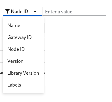
- By clicking the
Filtersbutton you can see the list of available filter options - Each filter is a field on the resource
- Selecting more than one filter applies
ANDlogic - By selecting a filter you can see one of the following filter
- Text input filter
- Selection filter
- Labels filter
Text input filter
This filter works in two different modes
- Regex
- In this mode performs case insensitive and is the value contains search
- Is In
- When supplying same option filter more than once, filter mode for that field switch to Is In
- Verifies that particular field has one of the input
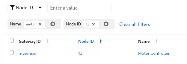
Selection filter
This filter works same as Text input filter
Labels filter
Label filter is a special filter used to filter a resource by labels.
You can supply label in the format of key=value
Examples:
- location=external
- zone=south
- version=2.0.2
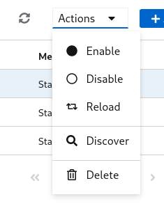
Action Buttons
- By selection one or more number of row, the action buttons drop down will be enabled
- Selecting an action on the dropdown apply to all the selected resources
Quick Buttons
- Couple of quick buttons will be on the toolbar
 - Refresh button, reloads the resources from the server
 - Add button, takes to add resource page
Last modified May 11, 2021: image and handlers update (5117036)